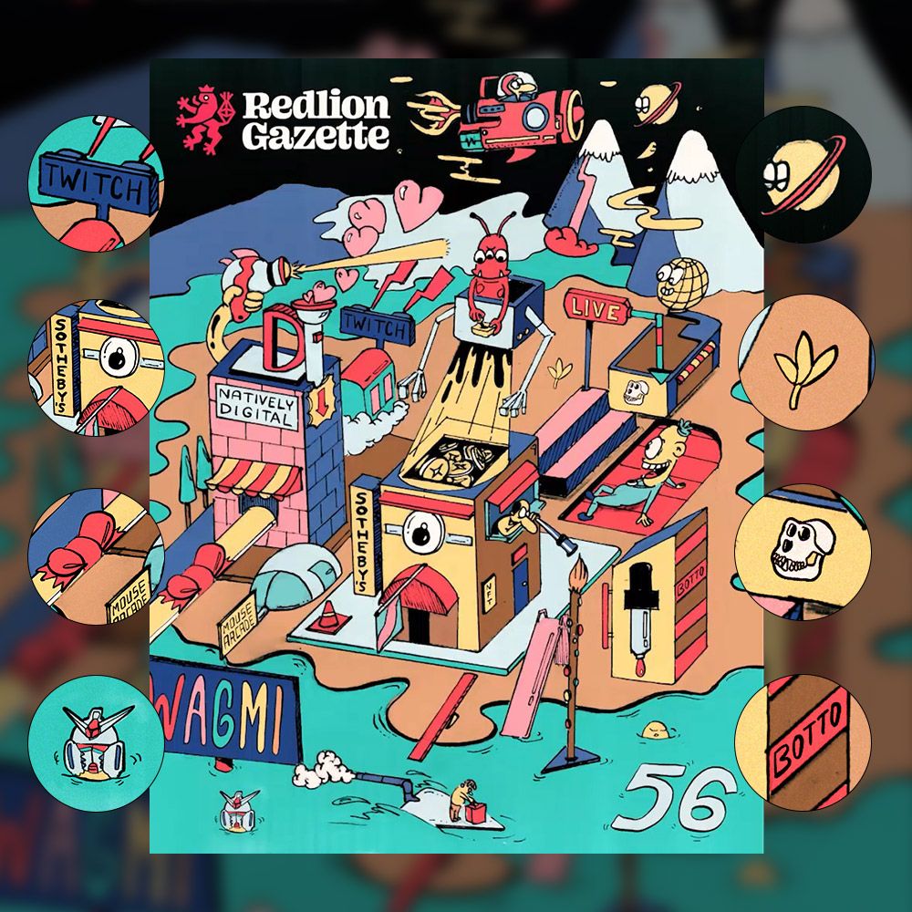
Hey frens! This week we took Sotheby's 2nd Natively Digital auction as the main depicted subject on our cover among other references.
As you may know, we have a new young art/design gun Amal on our team to take gradually a bigger and bigger part in the creation until his 100% cover debut will be born. His Sunday story in his own words is appended later in this cover breakdown too.

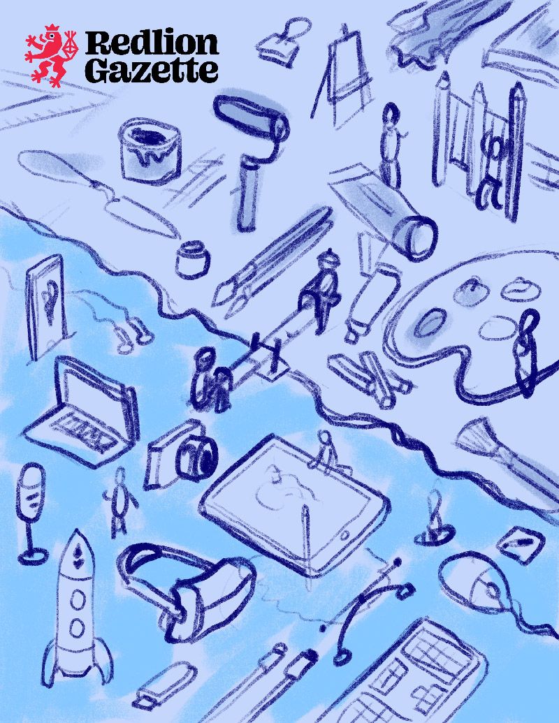
Formulating the concept is always the hardest part and a necessity for a great cover. We had few (probably bad) conceptions but Red being the main conceptualist came up with the idea of a childrens' playground divided into two parts: The digital and classic fine art, with two kids on the seesaw in the middle representing these two camps (as you can see on the sketch above). He also suggested we could use Amal's drawing style this time to kick off the drawing and my part would be to animate the final drawing.

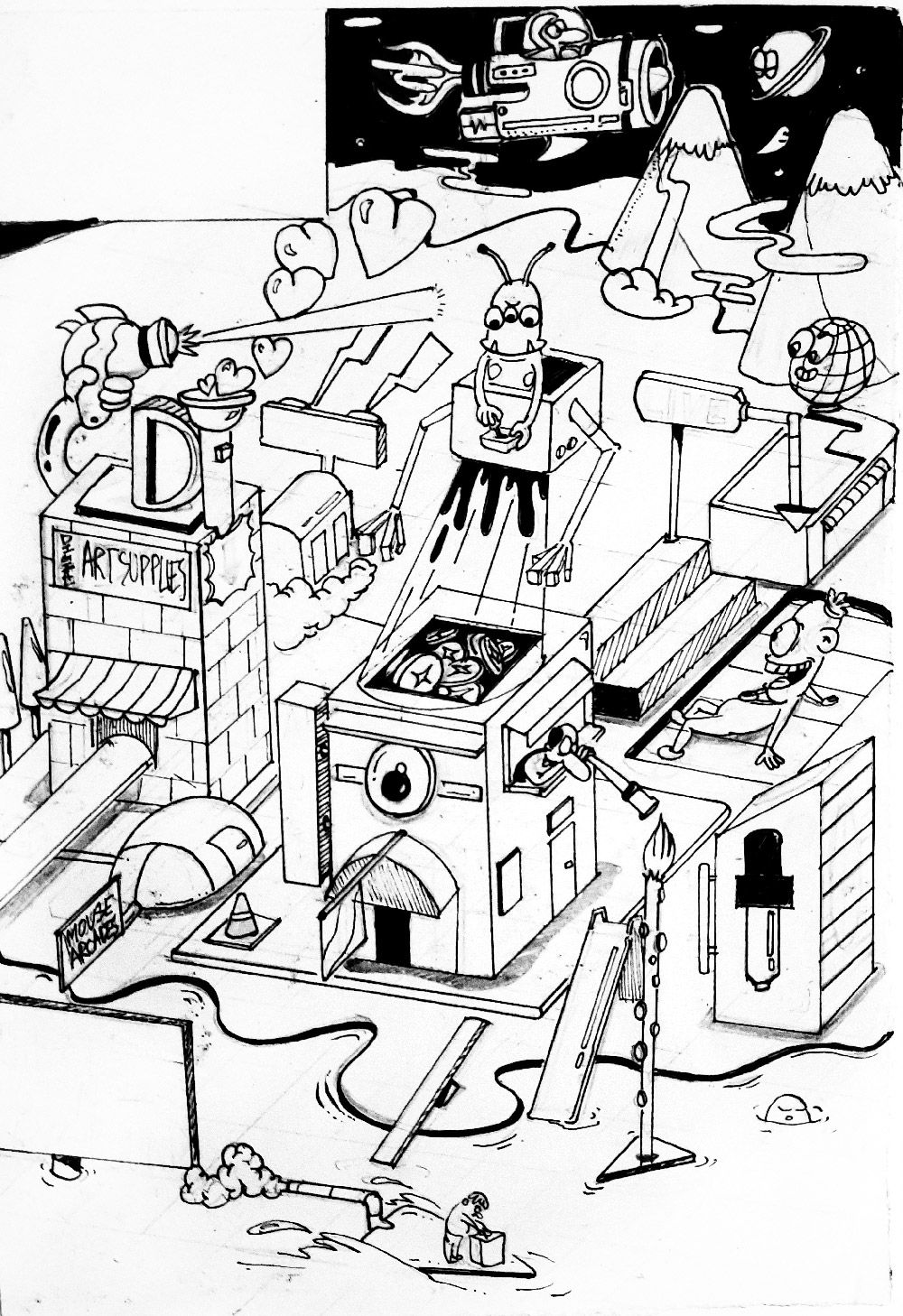
Because Amal is still waiting for his drawing tablet delivery he needs to work with classic media tools like paper, pencil, and liners. This already lovely illustration is representing the old and classic art world playing together on the same playground with Sotheby's overseeing them and evaluating them as equals. The original concept depicting conflict of digital versus classic art was shifted towards a more "working together" scenario. The fact that this artwork was born on paper, later digitalized, adjusted and colored on iPad further strengthens the depicted story.

Before you will have a chance to read Amal's thrilling story as we kinda threw him in the deep end let's explore some hidden references on the image above. You can spot symbols for almost all of issue #56 articles: Sotheby's scoping for artists and collectors, Twitch leaks, Meka robots standing/drowning, and many more that are buried deep under ingenuity.
Amal:
"56, you'll remember this number forever", said Dudly.
Yes, I will, for one too many reasons. When I was told I will have to draft a sketch for the cover I was thrilled at first but immediately dawned upon me our all common friend, anxiety. I had learned over the past 3 weeks about how much work goes behind Redlion so that our audience can have the best experience. The cover being a crucial part of the gazette carries with it the weight and hopes of the entire team to make the week successful. And I nearly bombed it.
The creative brief was to primarily portray the Sotheby's event and other smaller events that showed up last week. I took to the paper planning to execute this in an isometric style. Little did I know about the style but it's always good to experiment and learn new things, right? Right? NO. Not when you have a deadline breathing down your neck.
Nevertheless, I tried, and I almost got there but that's when I decided I should illustrate them all over again in Illustrator (vector graphic software) to make it even more perfect. Bad ideas come at no cost, at first glance. We were short of time, it didn't pan out well (halfway through it) and we immediately went back to the original sketch. I was wrecked for a hot minute.
Super thanks to Dudly we made it in the nick of time (about 6 am). I can not be more glad to have him as a support and guide in this journey.
This is in short a breakdown of the "breakdown" I almost had making this cover.
Hoping and striving to do it better next time. It's good to be grounded, to know you have miles to go and mountains to scale.
It's such a blessing that we have an audience we can share with all the achievements and perils that we go through. We believe in the 'Build in Public' concept. On that note, we will be back with badass covers and breaking news next week! Until then, peace out.
✌️
- Amal
Having no cover is not an option for our regular releases. 😅 Trying to re-create the artwork from scratch in Illustrator was a bad call, but lesson learned and the show must go on.
There was not much time left so I took the photo of the physical drawing from Amal and brought it to Procreate on iPad. First of all, I cleaned up pencil sketch remains and other dirt. Then there was a page ratio issue so more lines were added to the sides. Time was running out so I had to move pretty fast. The next step is coloring the entire drawing, adding more references and separating moving parts for animation in After Effects. The animations are quite basic but it was already too late to make it more complex. The day was saved in the end.
Diamonds are made under pressure and I am sure Amal will be an awesome cover artist as soon as he has a chance to become more "Natively Digital".
Kudos if you have reached the end of this long long story. Until next week, take care!


